From rebranding to renaming - a company’s journey
6 minute read

Pretty much exactly two years ago we celebrated our big rebranding. The facelift was long overdue at that time and our vision of a world where financial services seamlessly sync life became visible to the world.
But, two years - a small eternity in the fintech industry!
And a lot has happened in these two years. We have grown, perhaps even become more mature than we thought.
New international partners, a couple of funding rounds, hundreds of new employees and we have become - with the acquisition of Contis - a really big group of companies.
Not entirely without pride, we can now say that we are the largest embedded finance platform in Europe. The attentive reader will already recognize from this designation that our self-perception has also changed along with our growth. Banking-as-a-Service solutions are the core of our services, but embedded finance offers so many more possibilities.
To reflect this rapid growth, the restructuring that has taken place, and to release more synergies, the rebranding is now being followed by the renaming. But this is also a clear reference to our tech DNA, because we are more than just a bank. That has always been our identity – perhaps sometimes hidden behind the "bank" label.
So, Solarisbank becomes Solaris.
Roland Folz, Group CEO of Solaris explains:
"Driven by the vision the name Solaris symbolizes for us in its purest form the energy that powers us to make this dream a reality. Today, Solaris is a dynamic and constantly evolving ecosystem that grows with and simultaneously influences the market over the years."
Where are we coming from?
A look back allows you to trace the evolution of Solaris - both, in written and in visual terms.
Our original brand first saw the light of day in 2016. Back then, we were a small team with big ambitions. With wind in our sails after receiving our full German banking license, we burst onto the scene with the aim of becoming the centre of the fintech ecosystem, a platform upon which all other fintechs could build their businesses.
To reflect this role, we have chosen the sun as the key element of our brand – we want to act as the core of the financial solar system that attracts and empowers others.
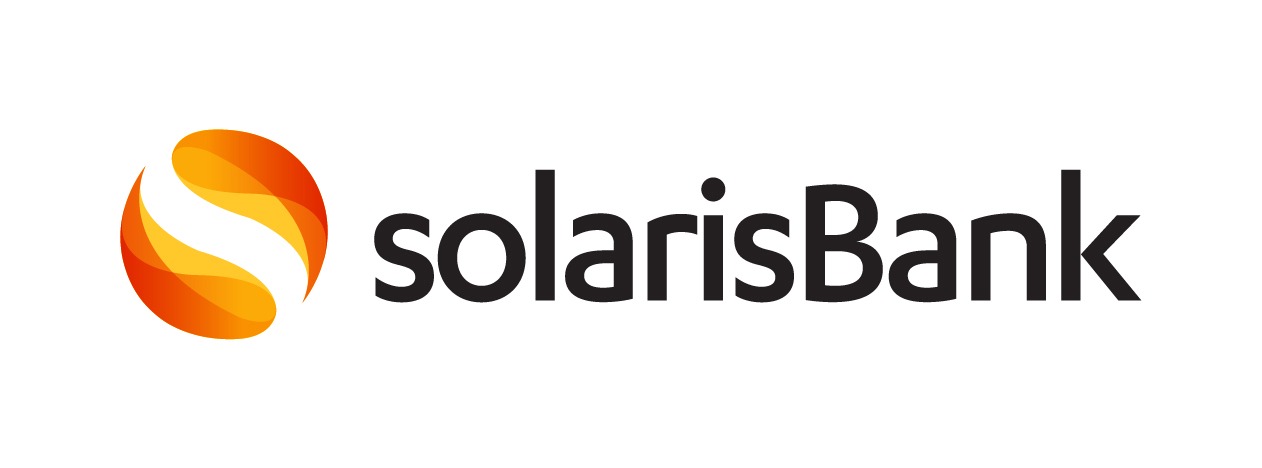
Our original brand has served us well over the years and holds many fond memories. While in its early days Solaris was a platform for fintechs looking for a regulated banking partner, we have since evolved into a technology platform for any type of company looking to offer embedded digital financial services.
In the last few years, when international companies and big brands joined our platform, we felt like it was the right time to elevate our brand to the next level. Its design and positioning no longer reflected our maturity and ambitions for the future.
Our original brand identity, anchored in the idea of the solar system, did not fully embody our partner-focused mindset. In fact, it was quite self-centered.
We knew our new branding should reflect our attitude of always focusing on our partners rather than ourselves. However, we also knew that our Solarians were very attached to our original brand.
Our logo – a seal of trust
A cornerstone of every brand’s visual identity is its logo. Two years ago we wanted to modernize and mature the logo without losing its essence.
Still, our ambition is to take the complexities of banking away from our partners to allow them to focus on what is really important to them. This is reflected in the idea of our logo that we developed two years ago. Quite simply, we reduced it to its most basic and pure form.
Today’s renaming also shows how much we rely on the reliability of our logo. The core of it remains unchanged. What we are playing with, however, are the spaces between the letters. So the letters look stronger, yes, one could think as punched.
We have been using the logo in many ways since the rebranding, yet its most prominent function is to act as a seal of trust.
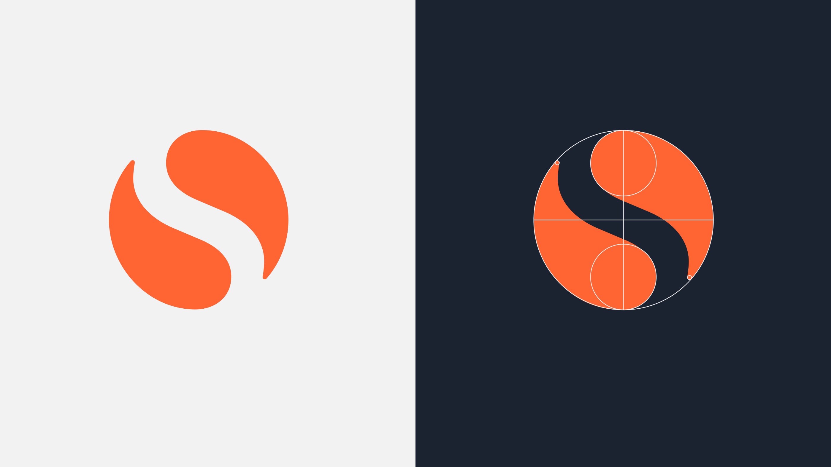
By isolating the image mark and using it as a standalone icon, it resembles a seal of trust that our partners can rely on, echoing the use of seals by banks of old when signing their documents. Wherever it appears, it bears our promise of excellence and integrity; an acknowledgement of the responsibility we hold as a licensed bank and technology inventor.
Simultaneously, it retains the heritage of the original logo. The universal imagery of the sun continues to represent an empowering force that helps our partners to flourish, while the symbiotic fusion of two equal parts coming together signifies the strength of partnership.
The signature Solaris orange harks back to our origins, retaining the recognizable, confident and optimistic character that the old Solarisbank brand had established.
The evolution of our visual language
The development of our own visual language is already starting with the 2020 rebranding. Here, we wanted the large variety of partners that we address to feel empowered and inspired by our offering, not puzzled or overwhelmed.
So, in tandem with the simplification of our logo, we decluttered our overall look and feel. We opted for a brighter and lighter visual language, leaving room for new ideas and acting as a canvas for our partners to tell their story on.
We introduced a new color palette with warmer and softer tones, lending a more human and approachable touch to the brand, which its predecessor had lacked.
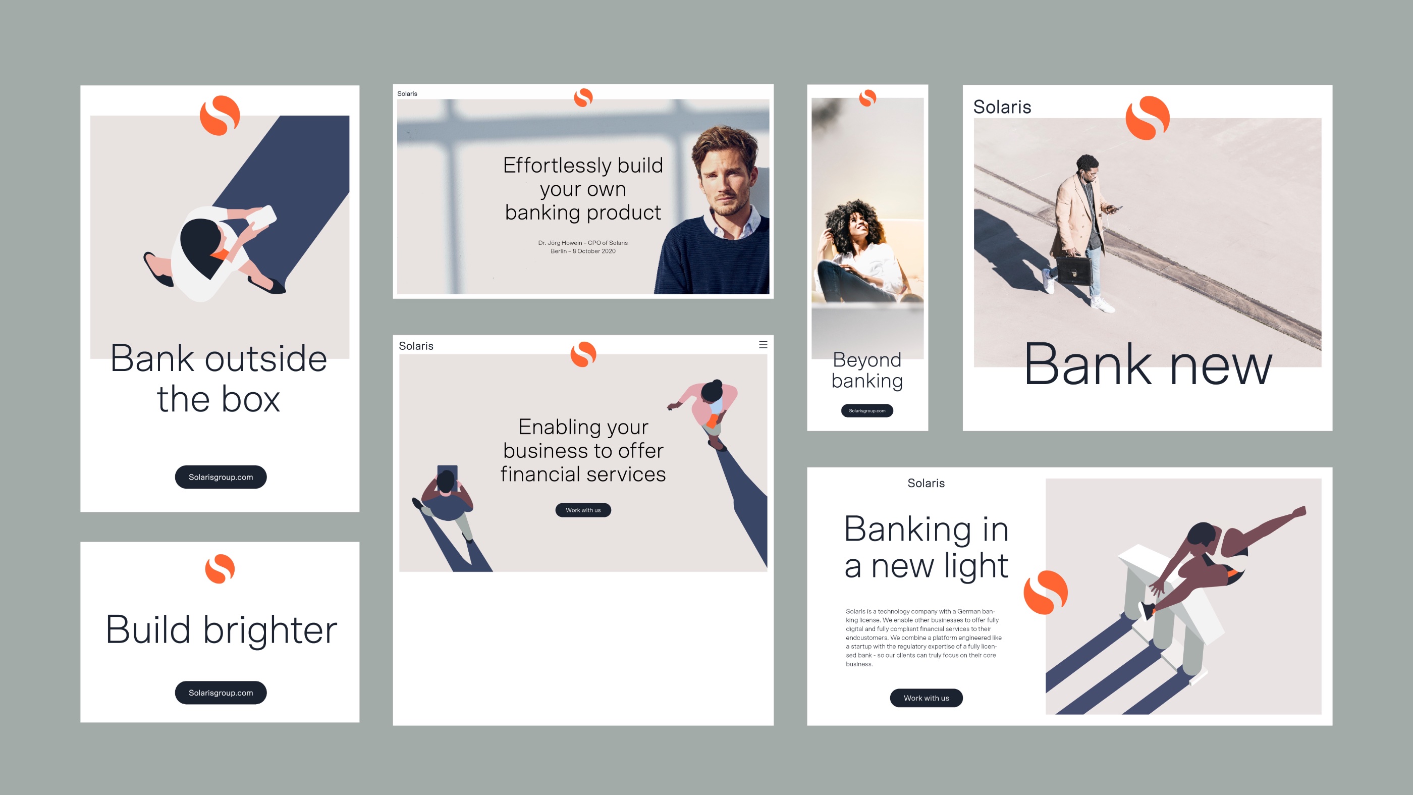
In addition, we developed an expressive illustration style that breathes life into our brand by showing how the technology we create is not anonymous, but touches the lives of people in meaningful ways.
With its dynamic, care-free figures and bright surroundings, it allows you to imagine all the possibilities that Solaris can create with its partners. We also incorporated distinctive, light-flooded photography into the brand, allowing us to show the people behind our technology.

Aisling Grainger, Brand Marketing Designer of Solaris, explains:
"I joined Solaris just after the rebranding took place, which was well thought out. One of the most striking elements of our brand is our distinctive illustration style. Our visual language is characterized by an inclusive approach. Figures and characters as well as product representations should not only look modern, but also make clear that social equality should extend to the financial space."
Having its own visual language is certainly a clear characteristic of a brand coming of age. But especially in the financial world, stereotypes still linger and inclusion of minorities or women is still not good.
We are here to change that.
As an identity-creating element, a visual language is far better suited than the written word, since images are much more primal in the human memory than language.
Identity formation, which is to a large extent guided by visual language, works in both directions: outward and inward. In this way, we send the signals of inclusion directly to our current and future employees. Everyone is welcome and every character contributes to the success of Solaris.
Nevertheless, we are also showing the industry that things can be done differently - holistic concepts are in demand!

"At Solaris, we have strong initiatives that address the issue of inclusion in particular. With my illustrations, I am following up on this. You can assign a gender and sometimes you can't - why should you, because it doesn't matter who uses our services, it only matters that we offer the best service to everyone. Fortunately, everybody at Solaris is convinced of exactly this vision. For me this is real innovation in the financial industry", says Aisling Grainger.
The sunrise: What we are standing for today
From rebranding to renaming it was still a long way.
By combining renaming - necessary due to the economic development of Solaris - and rebranding in our corporate communications, a complete picture emerges.
We perceive our company and our brand as a living organism. It does not remain static, but evolves with the growth of the people behind the company and the countless hours of work of all the employees involved in this unique journey over the years.
We want everyone at Solaris to enjoy interacting with the brand and the new name and carry it outwards as proud ambassadors.
“As a technology company with a German banking license, Solaris has always been a special player in the fintech ecosystem. Today, we are a pan-European platform with a broad product offering and steep vertical integration. Our tech DNA has enabled our growth in the past and will ensure our success in the future. Solaris is our brand core and unification across the group is only logical", adds Layla Qassim, Chief of Staff of Solaris.
The new name, which in its reduction offers more room for development, is also inclusive because we are not only bankers: We are thinkers, engineers, scientists, entrepreneurs and innovators.